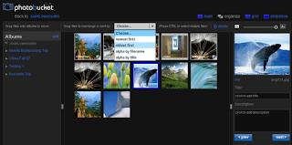
On Thursday, Photobucket introduced two new features: a way to skin albums and an overhauled organizational tool that lets users drag and drop photos into various folders.
Of the two, the organizer is the biggest enhancement. Users are taken to a dark gray editing environment that lets them make changes without the entire page having to refresh. Everything is drag and drop, which is useful for ferrying photos and videos between albums, and reordering album arrangement. There's also support for batch operations, so you can quickly move, reorder, and rename multiple photos at once.
Compared with Adobe Photoshop Express and Flickr's Organizr, this new organizer isn't nearly as technical. Missing are things like group tagging, and control of the metadata. Considering you can add and edit tags from the individual photo pages this seems like an oversight.
The other big feature is the skinning of album pages. This is just another level of personalization you can give an album short of reordering the images. There are a few hundred themes to choose from, and like a blog theme on Wordpress.com, you can preview what it looks like before applying it. Each theme changes the colors of various page elements, with the centerpiece being the background. I found most of the themes with background images to be too distracting, but there are some simpler ones that dramatically improve the somewhat barren white look the service had before.
In addition to the grouping of Photobucket-built themes, users can design their own with a simple editor that lets them pick the color scheme, background image, and border colors. You can preview all of the changes in real-time, then push it out to one or more of your albums. There's also a publishing feature that lets you share it with other Photobucket users.
One thing I'd still like to see with both of these features is more cohesion among other parts of the service. For instance, if you want to edit a photo from the organizer, it kicks you out to the special partnered FotoFlexer editor. Likewise, if you're in an album and want to rearrange the shots it feels like you're going to a completely different site. I'm not saying Flickr's done a better job at this, however on Photobucket the experience feels far more disjointed.
Article source: CNET


Tidak ada komentar:
Posting Komentar